
The Return of Colour: Kitchen Cabinet Trends for London Homes in 2026
- Avalon Projects
- Jun 30
- 6 min read
For the best part of a decade, the default London kitchen was white. White cabinets, white worktops, white walls. It photographed well, it felt safe, and it matched everything. But walk into any showroom, browse any design publication, or look at the kitchens we're building across Chelsea, Fulham, and Kensington right now, and the message is clear: colour is back — and it's not going anywhere.
The shift has been building for a while, but 2026 is the year it's become impossible to ignore. Homeowners who once wouldn't have considered anything beyond a neutral palette are now requesting deep greens, rich blues, warm terracottas, and even burgundy on their cabinetry. And they're doing it with confidence, not as a trend-chasing exercise, but as a deliberate choice to make their kitchen feel like theirs.
Here's what we're seeing — and how to get it right.
The All-White Kitchen Is Over (Sort Of)
Let's be precise: white hasn't disappeared. But the cool, clinical, high-gloss white kitchen that dominated the 2010s has lost its grip. In its place, homeowners are choosing warmer, softer off-whites — think creamy linens, chalky ivories, and warm stones — that feel lived-in rather than showroom-fresh.
Pantone's 2026 Colour of the Year, Cloud Dancer, reflects this shift perfectly. It's the first time Pantone has chosen a shade of white, but it's telling that it's a warm, airy one rather than a stark bright. It works brilliantly as a base — on walls, ceilings, and upper cabinets — allowing bolder shades on islands or base units to do the talking.
For our kitchen projects, warm off-whites paired with a richer accent colour have become the most popular combination by a clear margin.

Blue Is the Fastest-Growing Kitchen Colour in Britain
If there's one colour that defines the 2026 kitchen, it's blue. Not a timid duck-egg, but deep, confident shades with real presence.
Tom Howley's design team reported a 147% increase in blue kitchen sales over the past year, making it their fastest-growing colour choice nationally. That's a remarkable shift from the sage greens and muted neutrals that dominated just two years ago.
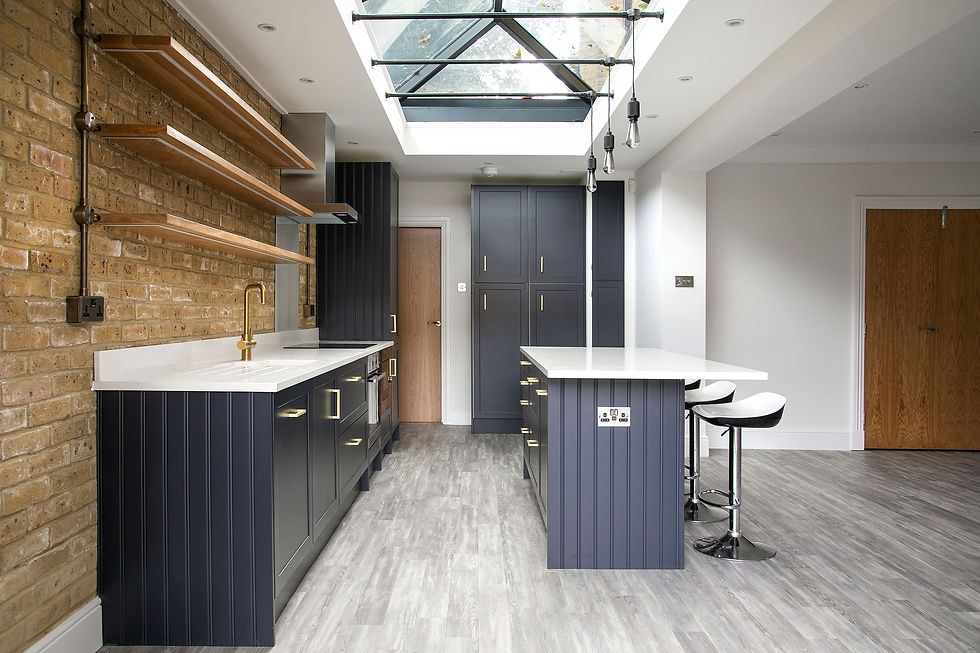
The shades driving the trend are rich and layered. Farrow & Ball's Hague Blue — an inky, dramatic navy with green undertones — has become a go-to for kitchen islands across London period properties. It pairs beautifully with un-lacquered brass hardware and natural marble or quartz worktops. Stiffkey Blue, another Farrow & Ball staple, offers a slightly softer alternative that works particularly well in north-facing kitchens where light shifts throughout the day.
We're also seeing lighter, chalkier blues making an entrance — pale powder blues on upper cabinetry, balanced with darker base units or a contrasting island. This two-tone approach adds depth without overwhelming smaller London kitchens.

Green Evolves: From Sage to Something Richer
Green has been a kitchen favourite for several years now, but the tone has shifted. The pale sage that had its moment in the early 2020s is giving way to deeper, earthier shades — olive, moss, and forest green — that feel more grounded and intentional.
Farrow & Ball's Studio Green, their darkest green, is one of the most specified cabinet colours of 2026. It reads almost black in lower light, which gives it enormous versatility in London's often-variable natural light conditions. Paired with a warm white like Slipper Satin on the walls and aged brass cup handles, it creates a kitchen that feels refined without trying too hard.
Homes & Gardens' 2026 kitchen colour forecast confirms what we're seeing on site: green remains the colour designers reach for most, but the emphasis has moved from trendy to timeless — earthy, nature-inspired tones that complement warm timber and natural stone.
Warm Neutrals Replace Cool Greys
The shift away from cool greys has been one of the quieter revolutions in kitchen design. For years, grey was the default "not white" choice. It felt modern, it was everywhere, and it matched stainless steel appliances and polished chrome hardware.
In 2026, the palette has warmed up considerably. Mushroom, taupe, stone, putty, and clay tones are emerging as the new neutral foundations. John Lewis of Hungerford's 2026 trends report describes this as a move towards tones that feel grounded and inviting rather than clinical. We'd agree. These colours work particularly well with the natural timber cabinetry and warm metal hardware that are defining the high-end London kitchen right now.
On our home renovation projects, we're pairing these warmer neutrals with natural oak or walnut joinery details — open shelving, range hoods, and breakfast bar surrounds — to create kitchens that feel cohesive and considered.
The Bold End: Burgundy, Terracotta, and Plum
For homeowners who want something with more personality, 2026 is opening the door to colours that would have been unthinkable on a kitchen cabinet five years ago. Deep burgundy, warm terracotta, and rich plum are all appearing — used selectively, and to striking effect.
This isn't about painting every surface a dramatic shade. It's about introducing a single bold element — typically an island, a pantry unit, or a bank of tall cabinetry — in a colour that anchors the room and gives it character. Livingetc's cabinet colour predictions for 2026 highlight this trend, noting that homeowners are moving away from safe neutrals towards colours that feel personal and expressive.
In our experience, the key to making bold colours work in a London kitchen is balance. A deep burgundy island looks extraordinary when surrounded by warm off-white perimeter cabinetry, brushed brass fixtures, and a light natural stone floor. Without that contrast, it risks feeling heavy.

Two-Tone Cabinetry: The 2026 Default
If there's a single technique that ties all of these colour trends together, it's two-tone cabinetry. Rather than committing every surface to one colour, homeowners are mixing darker base units with lighter uppers, or introducing a contrasting island.
The most popular combination we're seeing across our projects is a warm off-white or pale stone on the wall units, with a deeper shade — Hague Blue, Studio Green, or a warm charcoal — on the base cabinets and island. It visually grounds the room, hides the inevitable scuffs at lower levels, and makes the kitchen feel taller.
Tom Howley's 2026 trends overview describes this layered approach as clients becoming more confident with colour, introducing it in considered, deliberate ways on islands, pantries, or feature cabinetry rather than across the board.
Hardware Matters More Than You Think
A new cabinet colour is only half the story. The hardware you pair it with either elevates the scheme or undermines it.
In 2026, aged brass — specifically unlacquered, so it develops a natural patina over time — has become the dominant choice for dark-painted cabinets. It brings warmth to deep blues and greens without the harshness of chrome or polished nickel. For a cooler scheme, brushed nickel or antiqued bronze offer a more understated pairing.
The handle style is shifting too. Shaker-profile doors remain the most popular in London, but the frames are getting slimmer — the "super skinny" shaker with a narrow 25mm frame gives the cabinetry a cleaner, more contemporary feel. Handleless push-to-open mechanisms are growing in popularity for runs of cabinetry where a seamless look is the priority, though most of our clients still prefer a visible handle on the primary units.
Making Colour Work in Your Kitchen
Colour confidence is one thing. Getting the execution right is another. A few principles we consistently apply on our kitchen renovations:
Test in your actual space. Every kitchen receives different light — and London light changes dramatically through the day and between seasons. A colour that looks perfect in a south-facing showroom can feel entirely different in a north-facing basement kitchen. Always test sample pots on your actual cabinet doors, in your space, before committing.
Balance bold with neutral. If the cabinetry carries a strong colour, keep the walls, ceiling, and flooring lighter and quieter. The colour should feel like a feature, not an onslaught.
Consider the worktop pairing. Natural stone or quartz with warm veining works beautifully with deep blues and greens. Pale, clean quartz suits warmer neutrals and earthy tones. The worktop and the cabinet colour need to have a conversation, not compete.
Don't forget the floor. Engineered oak in a warm, natural tone is the most versatile flooring choice for a coloured kitchen. It anchors the scheme without fighting the cabinetry. Herringbone patterns add texture and interest, particularly in open-plan spaces where the kitchen runs into living and dining areas.
It's Not About Following — It's About Choosing
The real story of 2026 isn't that everyone is painting their kitchen blue or green. It's that homeowners finally feel free to choose a colour that reflects how they want to live, rather than defaulting to what's safe. That's a good thing — and it's producing some of the most characterful, personal kitchens we've worked on.
If you're planning a kitchen renovation and want to explore what colour, materials, and layout could work for your home, we'd love to talk it through. Take a look at how we work, browse our completed projects for inspiration, or get in touch for a free estimate.


Comments